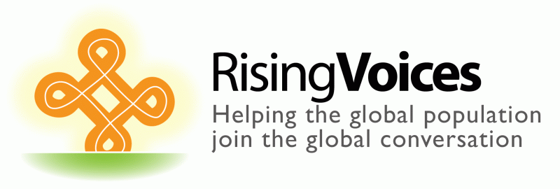
Original RV logo. Gill sans text, adinkra rising over horizon icon.
I've been working on a new brand/logo for Rising Voices. The old logo, though nice, has started to feel dated, and never really worked well on most backgrounds due to it's soft shadow and black+orange contrast.
While we're willing to use a variant of the old logo (GV adinkra icon rising over the horizon like the sun) we also want to explore completely new directions to see if there is a simpler visual metaphor that would work better on its own.
Various icons taken from the Noun Project, a great resource for open-licensed iconography with a thought-provoking search function that gives you interesting results for queries like “community” and “help”.
Here's a simple start using Etica, the playful headline font from the redesigned GV site and a flattened GV icon:

Etica font, classic adinkra icon.
Next the same font, but with a raised hand rather than an adinkra. It's visually simple and strong, but does the hand convey a meaning that matches the mission of Rising Voices?

Etica font, single hand icon
A variant with multiple hands raised together. I think this gets at Rising Voices better than a single hand. It's very similar to the old Voices Without Votes logo, but that's not necessarily a bad thing!

Etica font, rising hands icon.
This version might show the hands “working together” rather than simply being raised and asking for attention. Do you think it works visually as well as it does metaphorically?

Etica font, cycle of helping hans icon.
Font Variants: Etica, Helvetica Neue, Open Sans
Now a few font variants using the basic logo. Does one or another feel more appropriate for Rising Voices?

Helvetica Neue font, classic adinkra icon.

Open Sans font, classic adinkra icon.


9 comments
I must say, I don’t dislike the new logos, but I am already finding it difficult to let go of the current logo!
The current logo is on it’s way out, Eddie says so! Say your soulful goodbyes now :P
Not sure I want to get rid of the adinkra because that is our link to the rest of Global Voices. I am thinking more about getting rid of the halo and the green horizon. Probably choosing just a shade of blue and an orange for the logo. Not too radical!
How about adding an option with a symbol that indicates/ cues nurturing?
I loved the monkeys until I realised they are not intended to be monkeys!
http://thenounproject.com/term/baby/53272/
How about using Helvetica font, and combine rising hands and adinkra?