 [1]
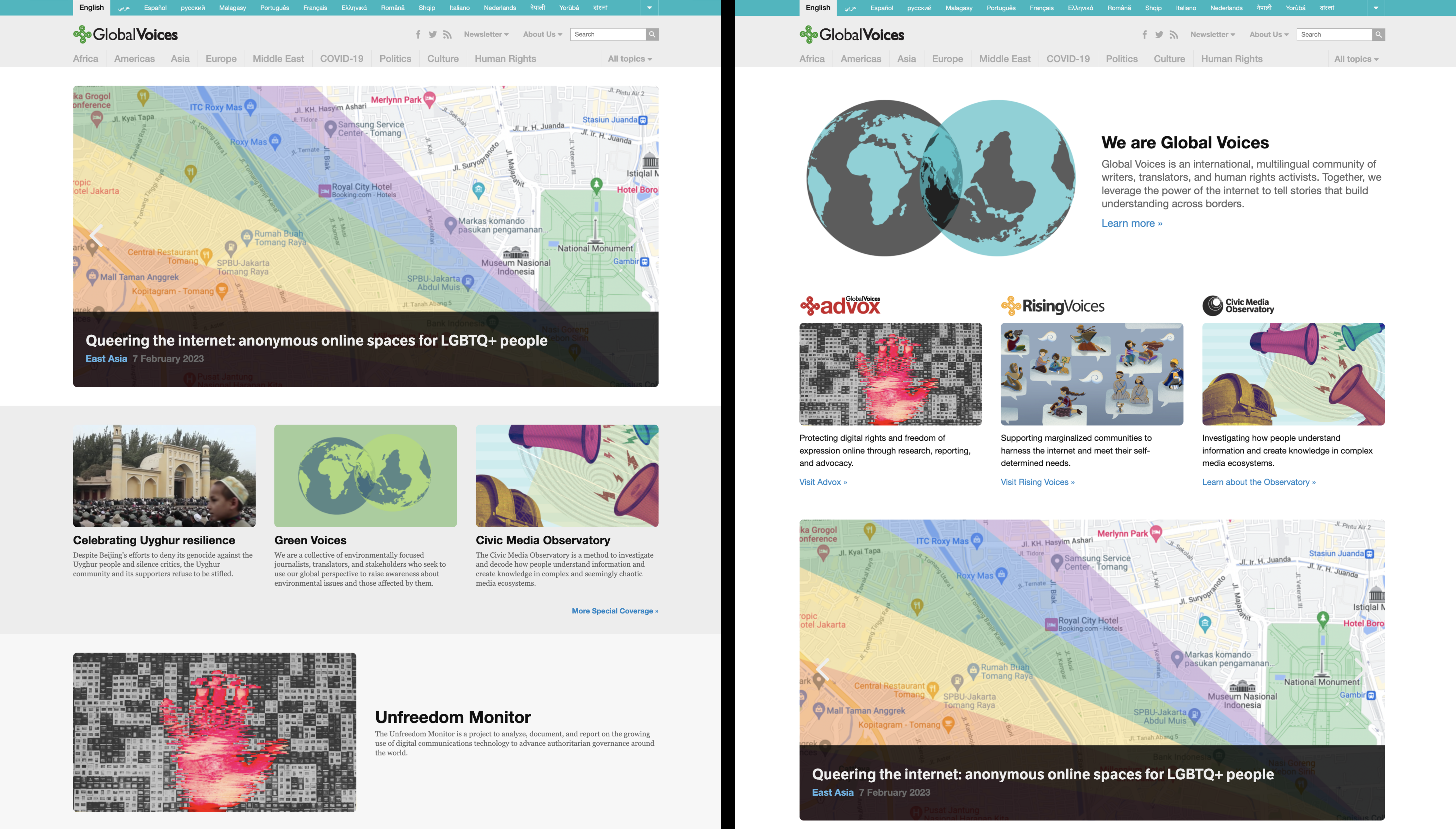
[1]Two of the versions of the homepage we'll be testing, showing the possibility of devoting more homepage space to explaining Global Voices and our sub-projects.
Hi all, Jer the GV Tech Lead here to deliver another update on our experimentation with the content of the homepage on GV. Check out the results of our previous experiments with the “featured posts slider” [2] for some background if you're curious.
What is “A/B” testing?
“A/B” testing [3] means serving two different versions of your website randomly (an “A” version and a “B” version) to collect data and compare the two.
GV is using A/B testing more and more to assess new design ideas and evaluate how they impact visitor engagement and overall traffic, as tracked by Google Analytics.
The A/B test we're starting today relates to a question we've long wondered about: Should the top of the GV homepage have some kind of explanation of what GV is?
For a long time now, the homepage has been almost entirely dedicated to displaying articles, whether in the featured posts slider, the main list of posts, or the topical widgets like the ones that show recent Advox and Rising Voices posts. This is a great way to point visitors to our stories, but considering that we've heard over and over how people don't always understand who we are and what our mission is, there's a good argument to be made that we should invest some of that homepage space to explaining it, and pointing people to where they can learn more.
Variations being tested
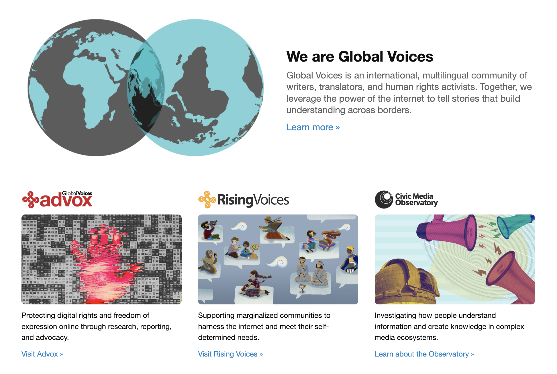 [4]
[4]The “About GV” widgets. Click to enlarge.
Thus this test is born: We have crafted a set of widgets that explain GV as a whole, as well as our three main projects, Advox [5], Rising Voices [6], and the Observatory [7], and we will be testing what happens when we show these on different parts of the homepage.
One version of the site has a huge section right at the top explaining everything, another has the two “about” sections spread out, and a third moves both sections down to the center and footer of the site.
So be prepared for some jumping around! While the test is running, you may find the homepage looks slightly different each time you look at it.
What we're looking for in the stats
The goal of this test is to see if having this explanatory material at the top of the site helps or hurts the various metrics we track related to user behavior. Our hope is that we can have this useful information at the top without interfering with vistors’ ability to find our stories and click on them, and that it might even encourage more people to stay engaged! On the other hand, we might find that people don't engage with the new content, and end up leaving without finding our stories.
If we find that adding this new content has a significant negative effect on our main goal of helping people find our stories, we'll have to remove it or put it lower on the site. If we find the new content helps or at least doesn't harm the engagement with articles, then we'll start showing it permanently at the top, and keep working to refine the content itself.
What do you think?
Is the “About GV” section at the top of the site a good idea, in your opinion? Do you think it will help people be more interested in our work, or just get in the way of returning visitors finding the latest news? We'd love to hear your thoughts, and are always taking everyones opinions into consideration, along with listening to the hard data from our analytics.