Hi all, Jer the Tech Lead for GV here with another update about the ongoing design changes to our sites. This change is unusual because it has both aesthetic and technical reasons behind it. Read on to see specific demos of what has changed, since it might not be obvious unless you look at the direct comparisons, and to learn why we are updating the fonts used across the GV WordPress sites.
Lingua Translation Managers, please see the end of this article, where I'll describe how we can review the fonts used for your language in light of the changes!
New “Humanist” fonts for headings
The biggest change you'll notice is to the “Headings” font, which shows most prominently as the post title on single article pages, but is also used for many h2, h3, etc across the site. This font was changed from the Adobe-hosted LFT Etica, to a new “Humanist” set of system fonts that are bolder and more stylized:
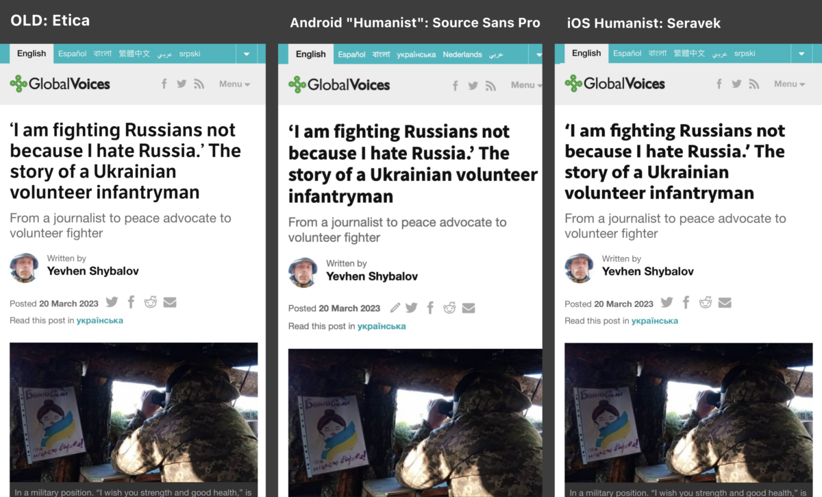
Click to enlarge. The old and new fonts on mobile. iOS and Android have beautifully-equivalent fonts for this purpose, matching very well.
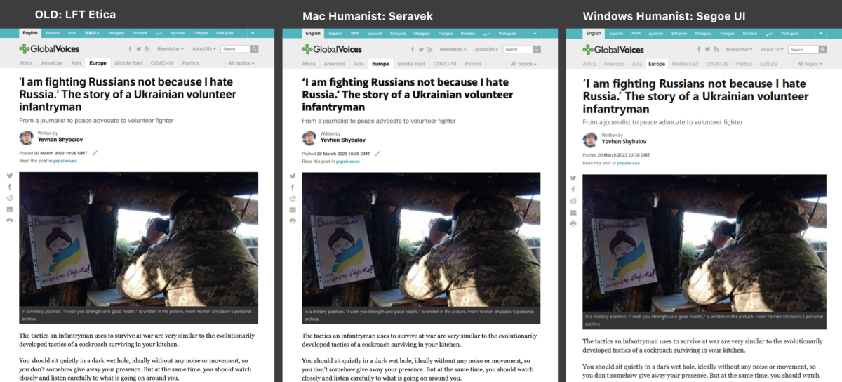
Click to enlarge. Old and new fonts on desktop. On Mac we see the same font as on iOS, Seravek, which looks great. The Windows equivalent, Segoe UI, isn't quite as refined, but is still strong and readable, and matches the style.
New “Neo Grotesque” fonts for default text
A smaller change was to our “default” font, which shows in most other parts of the site, such as the site header, post metadata, and headlines in lists of posts. Historically we've used “Helvetica Neue” for this, with various fallbacks for other systems to try and replicate the same look. Helvetica Neue is considered a “Neo Grotesque” font, which is just a descriptor for the style of fonts in the “Helvetica” family. In our rework, we continue to use a “Neo Grotesque” font for each system, but with better alternatives to “Helvetica Neue” for Mac and Windows.
On Mac/iOS the differences are subtle and easy to miss. On Windows we switched to Segoe UI, which isn't quite a “Neo Grotesque”, so the change is more pronounced, especially in the headlines:
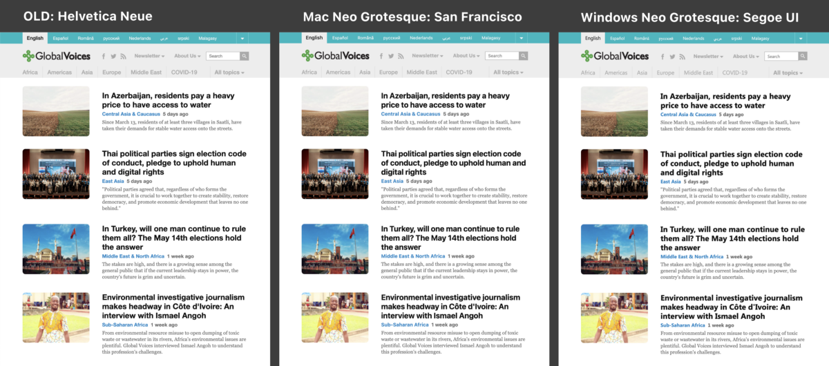
Click to enlarge. Old and new fonts on desktop. On Mac we see the same font as on iOS, Seravek, which looks great. The Windows equivalent, Segoe UI, isn't quite as refined, but is still strong and readable, and matches the style.
Note that on Android we were already using the “Roboto” font for this purpose, so nothing has changed there, it looks almost exactly like the “Mac Neo Grotesque: San Francisco” version above.
Why a font refresh was needed
The main reason I wanted to change our fonts was to change how the fonts are delivered, so that the site can be faster, lighter, and more private. The way we achieve this is by using 100% system fonts.
Since our major 2014 redesign, the site has relied on Adobe's font-hosting service to serve up several fonts used on the site. This is a common practice, with the most popular host being Google Fonts. The upside of using hosted fonts is that the site always looks exactly the same, regardless of which fonts are installed, and that you can use fonts that almost no one has installed, like the LFT Etica font we used for our headlines on GV.
That said, the disadvantages of hosted fonts are significant: Each user has to download the font, giving the site a larger download size and more complex javascript, both of which slow it down, especially on mobile. When using a solution like Adobe fonts, visitors are also exposed to tracking by Adobe, which we consider an unnecessary downside.
The alternative solution, which has gotten more and more viable over time, is to use only “system” fonts, which means ones that are already installed on the user's operating system. In the past this was very limiting, because there are so few fonts that are common to all systems, but computers and phones now come with many sensible and elegant fonts by default, and we can now have many creative options without resorting to hosted fonts.
The trick to using system fonts is finding a set of fonts across various systems that match each other in style and size, which can get very complicated. Thankfully someone already did the work for us: Modern Font Stacks. This site offers various categories of fonts like “Antique”, “Handwritten”, and “Humanist”, then gives a list of fonts that will, together, ensure that all operating systems will render the text in a similar way. We used Modern Font Stacks, then refined two different stacks “Humanist” and “Neo-grotesque”, to ensure as much consistency as possible for our needs.
You can see the results live on the site now! Depending on which operating system you're using, the updated text on GV will look a little different, but in every case it will load instantly, privately, and be part of an overall brand identity.
Fonts used on various systems
For anyone curious, here are the font stacks themselves, and the fonts we expect to be used on the most common operating systems. Whenever possible, we rely on the system-ui fonts for each system, such as “San Francisco” and “Segoe UI” because they were specifically designed for readability and have the best multi-language support.
You may notice that on Windows “Segoe UI” is used in both “Humanist” and “Neo Grotesque” stacks, and that “Nimbus Sans” is used for both on Linux. This was due to those being the best fonts available for both the “Humanist” and “Neo-Grotesque” categories. Both are well-rounded easy to read fonts, and with the variation in weight (boldness) I think the site still feels textually diverse.
Also worth noting: We had already switched to a “System” font for the text used in full article text, where we've been enjoying Georgia for several years!
“Humanist”
This font stack is used for “headings” (section titles) and for the title of posts on their single-article screen.
font-family: 'Seravek', source-sans-pro, BlinkMacSystemFont, -apple-system, 'Roboto', 'Nimbus Sans', system-ui, sans-serif;
- Android: Source Sans Pro
- iOS+macOS: Seravek
- Windows: Segoe UI
- Linux: Nimbus Sans
“Neo-Grotesque”
This font stack is used for the rest of the site, including all the small text in the header of the site, text surrounding articles, and article headlines when they are shown in lists like on the homepage.
font-family: BlinkMacSystemFont, -apple-system, 'Roboto', 'Nimbus Sans', 'Segoe UI', system-ui, sans-serif;
- Android: Roboto
- iOS+macOS: San Francisco
- Windows: Segoe UI
- Linux: Nimbus Sans
Lingua: Customizing fonts for your language
One of the complexities we hope this setup will improve is our handling of non-Latin languages, like many of the Lingua sites that make up GV. The new stacks all use system-ui as a fallback, which should mean that for most languages, a sensible fallback is chosen.
But it's possible that for some languages and scripts, the new font stacks will result in a worse-looking, or strangely-styled font being chosen by the system. If that is the case for your Lingua site, no problem! The GV theme is set up to allow customization of the fonts used for each site, so just get in touch with me (Jer) and we can work out a setup for your site that either looks like the old design, or something new that works better!
Thanks for reading
Please let us know what you think of this change, and as always if you find any bugs or surprises, please let me know (with a screenshot and link if possible!
🙏🏻

