Design Update: No-Sidebar article display
Following-up on Design Testing on Global Voices and the new “Skinny Post” Variation, today we are launching an update to all GV sites that makes the “skinny post” (no-sidebar) design the default.

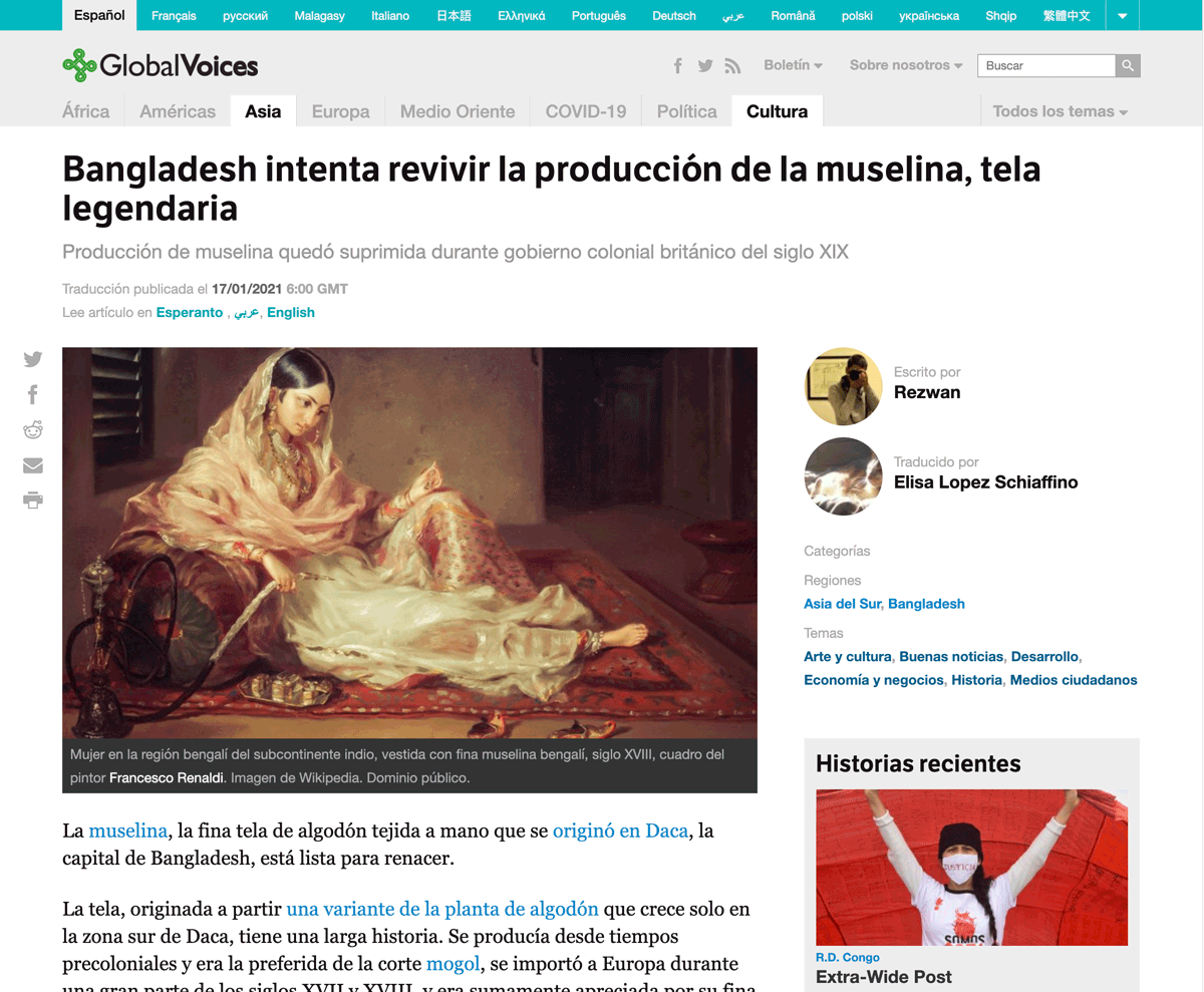
The old and new post designs. The sidebar will no longer show beside posts on Global Voices.
Sidebars on posts are officially disabled
If you've been reading Global Voices over the past couple of months, you've probably noticed it showing on some posts but not others: The sidebar is gone, and instead the post has more room to breathe on the sides.
If you're like me, you've been noticing how much nicer it is to read in that format. I know I personally have found myself refreshing GV articles trying to get the randomizer to give me the “no sidebar” version before starting to actually read ?
Well I hope you preferred the new version too, because it's now how all articles will look all the time from now on.
Analytics findings
I won't bore you trying to summarize all the numbers because the reports involved are very complex and have a lot of disclaimers, but here's what we found when we compared the two versions (with and without sidebar) using Google Analytics:
- All of the variations were very subtle and the behavior of most visitors seems to have been unaffected.
- The overall reading experience is better without the sidebar.
- Metric: Total reading time is slightly higher on the no-sidebar version.
- Metric: Readers are slightly more likely to scroll past the bottom posts in the no-sidebar version.
- Explanation: Qualitative feedback (everyone saying they prefer it) supports the no-sidebar design being more comfortable to read, which explains why readers would spend more time on our stories and be more likely to read them to the end.
- The no-sidebar version gets less clickthroughs to other posts.
- Metric: There was a slightly higher “bounce rate” in the no-sidebar version, meaning more people visited a single URL and left without reading for 30 seconds or clicking on any links.
- Metric: Visitors had slightly less “pages per session” in the no-sidebar version, which matches the “bounce rate” already described. They are more likely to leave rather than clicking on more pages.
- Metric: The no-sidebar visits had less “average events”, which tracks the number of actions people take inside the site. This is likely yet another signal that people are not clicking around the site as much.
- Explanation: When the sidebar is visible it has a huge, attention-grabbing set of “Top World Stories” headlines with large images. The analytics indicate these are not clicked particularly often, but they are still used by 0.5% of visitors, which is enough to create the effects in the metrics above. It is inevitable that hiding the sidebar would create this effect to some degree. When we put all the emphasis on the article itself, some people who might have clicked on a “Top World Story” will instead just leave if they find they aren't interested in the main story.
Our conclusions based on the findings above:
- With the no-sidebar design we give up a small amount of subsequent traffic from one post to another through headlines, but in exchange we improve reader comfort and have more engaged readers who finish articles.
- Everyone we've talked to prefers the no-sidebar version, and we believe it will lead to increased reader loyalty due to reading comfort.
- We will use the no-sidebar version as the default going forward!
So there you go. That's our thinking behind this change.
Other related changes

Example footer of a post in the new design, showing the new location of the COVID-19 Special Category badge, category listing, and “Top World Stories” headlines.
The essential change we're making is that the “tablet” design of GV, which normally only shows when the window is too thin to display a sidebar, is now the default layout regardless of window size. This has a few effects:
- Author credits will always show at the top of the post below the headline, like they do on mobile and tablet, rather than in the sidebar.
- Taxonomy terms (categories) will always show in the footer like on mobile, rather than in the sidebar.
- Special category badges, like the ones for Advox, Rising Voices, and The Bridge, will now show in the post footer, rather than the sidebar.
Another change we've made is to add more “related headlines” to the footer of posts. Previously in the post footer we showed “more from this region” with headlines based on a region category from the post. With this new design we will also be showing the “Top World Posts” headlines in the post footer. Hopefully this will help offset the clicks lost from people clicking “Top World Posts” headlines in the sidebar.
What about “Pages”?
On GV WordPress sites, “Pages” are the documents like the About and Contact pages that are linked in the header and footer and don't have dates or authors. For now we are not enabling the new design for pages, because their sidebars contain an important tool that helps people navigate what are often complex hierarchies of different pages.
The plan is to review the header of pages, add new way-finding tools like breadcrumb links, then disable the sidebar once we are confident that the sidebar is no longer needed.
What does the “Full-width content” option for posts and pages do now?
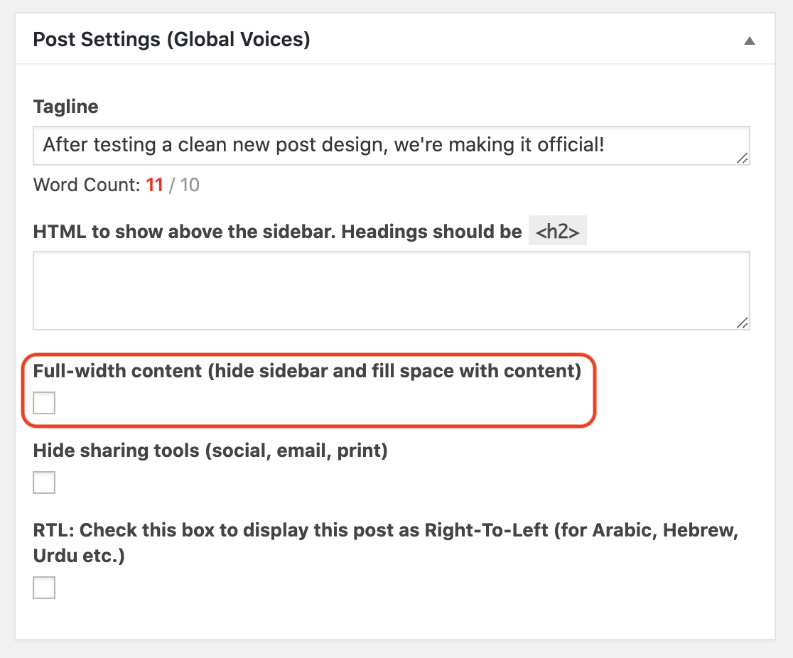
The “Full Width Content” setting below a post in the editor.
In the screenshot you can see the setting which shows in a box below the main post content when you edit a post or page. It says “Full-width content (hide sidebar and fill space with content)“.
Previously this did what it said: Hide the sidebar and use up that space to make the post content super wide. The Privacy Policy page on GV English is a good example.
After this recent change, it still does the same thing, making the content very wide, but without removing the sidebar just 'cause it's already gone! This setting can still be used like before if you want that width, but the good news is that we no longer have to use it just because we find the sidebar is annoying (which is often how it was used before).
When to use the “Full width content” post setting
This setting should be used when the actual content of a post or page works better when it's very wide. A good example is the Donate page where we use the extra space to have a two-column layout.
The problem with this setting is that making the content super wide also makes full-width text harder to read, because there is an optimal width beyond which text gets harder and harder to read. This property of typography is called “line length” and the GV design has been carefully optimized to have a comfortable line-length, but the “Full-Width” option throws this out the window.
So while the option to use “Full width content” is still there, we encourage everyone to use it sparingly, and always think first about the comfort of the reader and why this particular content needs to be so wide.
Thanks for reading
If you made it this far, I appreciate your dedication! Hope it helped you understand our thinking and that you agree! If you do or not, feel free to add comments on anything you'd like us to hear ??