
Hey you, this post is a little update on the design changes happening on GV and the process we're using to try out new ideas and see how they work.
Design work on GV is ongoing
After the recent design refresh of the GV sites the GV Design Working Group (made up of core team members and editorial leads) aren't planning to slow down. New changes will keep coming as we modernize the site visually and in terms of features and accessibility.
We hope you'll take this ride with us and let us know what you think! Right now we're trying out big new steps in creating a clean, easeful, and enjoyable reading experience with our stories.
“Skinny Post” variant, what do you think?
The specific change we're considering is to remove the sidebar from posts for all devices, including large desktop monitors. This “no-sidebar” reading experience is already our standard for tablets, mobile devices, and any browser that is too thin to fit the sidebar, but many of us feel it just looks and feels better without the sidebar even if there is space. So we're trying out a design that hides the sidebar regardless of window size, centering the post within whatever space is available.
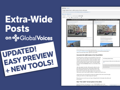
Here's how it looks compared to the previous design:

CLICK TO ENLARGE. Comparison of the two versions, “normal post” and “skinny post”. Remember that on tablet or mobile, they would both look similar to the one on the right, just with less white space on the sides.
As you can see, the biggest downside is the loss of the “Top World Stories” widget next to the post, as well as the extra space at the top that the author image and other metadata takes up at the top, pushing down the story itself.
On the other hand, the benefits are significant, as many people will agree that it looks cleaner and easier to read the actual story without the distractions presented by the sidebar.
Want to try it out in a real browser? Just add ?gv_css_variant=post_skinny_centered to the end of any GV story URL and you'll see the skinny version. Here's a link to the post in the screenshot in “skinny post” mode.
What do you think? Reply in the comments if you have a strong opinion!
A/B Testing and varying designs
“A/B” testing means serving two different versions of your website randomly (an “A” version and a “B” version) to collect data and compare the two. GV is going to be using A/B testing more and more to assess new design ideas and ensure that they help our traffic, or at least that they don't hurt it.
Right now we're running an A/B test on the “Skinny Post” variant described above, so depending on the roll of the dice, when you visit a GV story it might be shown without a sidebar.
In this case, we'll be looking at the stats in Google Analytics to see if people read for longer with the new version, as well as whether they are more or less likely to click through to subsequent stories. Once we have more information, we'll be able to decide whether to go with this new version, as well as what improvements we should focus on making to it to avoid any pitfalls.
So if you see things looking a little different, and it feels a little random, then don't worry, it's supposed to be!
Thanks for reading and let us know what you think ?

5 comments
I love the skinny post. It looks refined and my eyes can move in one direction when reading. :)
Thank you Jer and team. I like this simple design. As Atiba said, it’s easy on readers eyes.
Hi Jer, hi GV Design Working Group,
Great work! This skinny layout is a real improvement, focused on “mobile-first” design trends. More of that, readability is much much better. Maybe the next step could be to get rid of these unhelpful modal popups? ;)
Thanks GV for this evolution!
Why is my new post add option postponed?
I give me all access page on my community globalvoices.org .
My user id : Birmal Henbram.