Hi all, this is an update to my ongoing series of posts about design testing and the resulting changes we make to GV. My previous post, Design update: A/B testing homepage “About GV” content, was published a while ago, so I have a few things to report. I'll start by describing the current test we're running, then go over the outcomes of our previous tests.
Re-running the “featured posts slider v. grid” A/B test
This is embarrassing to admit, but while running our newer tests, I realized there was a disastrous bug in my implementation of the previous tests from 2022. You can read about the original tests in Design Update: Final decision on featured posts (for now). The bug means that we need to re-run the test to get accurate data.
What is “A/B” testing?
“A/B” testing means serving two different versions of your website randomly (an “A” version and a “B” version) to collect data and compare the two.
GV is using A/B testing more and more to assess new design ideas and evaluate how they impact visitor engagement and overall traffic, as tracked by Google Analytics.
The tests in question were counting how often people clicked on various versions of the “featured posts” block at the top of the site, and we chose the format that got the most clicks. The bug was that when people clicked the “next” and “previous” arrows on the animated slider format, we were counting those clicks as if the person had chosen a story to read, which is terrible! It turns out that for every actual click on a story, people click 6-8 times on those arrow buttons, which totally screwed up the data.
So, knowing this, and having fixed the code that counts clicks, we're running this test one last time to find out the truth. Based on the previous data, it looks like the “grid” format, which shows 4 stories at once and has no animation, will be the winner, but with these tests there are always surprises.
Homepage “About GV” content test results

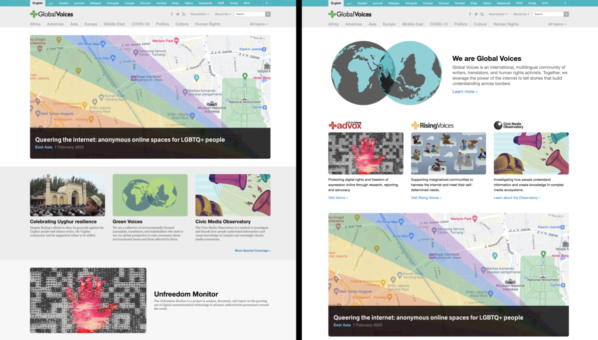
Two of the versions of the homepage we tested, showing the possibility of devoting more homepage space to explaining Global Voices and our sub-projects. Click to enlarge.
Next I'll summarize the results from our March 2023 test of the, homepage “About GV” content. In this test we were analyzing the effects of adding an “About GV” section to different parts of the homepage, as you can see in the image above.
The reason we want to add this section is to help readers understand what GV is all about when they visit our homepage. We don't want to do it at the detriment of them finding our stories though! We had a version where the new content was at the top of the site, above featured posts, a version where it was below the featured posts, and a version where it was at the very bottom of the site.
The results weren't very dramatic. We didn't see a big increase or decrease in the amount of time people spent or how much they engaged with the posts on the site. There was a slight decrease in engagement when “About GV” was above all posts, and an even less noticeable decrease when “About GV” was between the featured posts and the rest of the content.
In the end, we decided to keep the “About GV” section in between the featured posts and the rest of the site, which felt like the best compromise between explaining what GV is, and helping visitors find stories to read.
You can see the widget below the featured posts on the GV English homepage right now.
Lingua managers: How to add this widget on your Lingua homepage
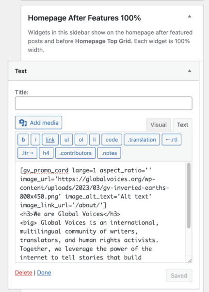
For any Lingua managers that want to add a translation of this new “About GV” section to your site, all you have to do is add a widget to the Homepage After Features 100% sidebar with the following code, then translate the text and update the “Learn more” link to point to your translated version of the GV about page.
You can create the widget by going to WP Admin > Appearance > Widgets, finding the Text widget on the left, then dragging it up to the Homepage After Features 100% section.
See also: Full documentation of the [gv_promo_card] widget.
If you need any help with this, just contact me (Jer Clarke), on the GV Slack and I'll be happy to dig into it with you.
Newsletter popup test results
The test we ran in the second-half of 2023 was one I've been hoping to run a long time. It compared the site with and without a promotional popup when users first visit, to see if the popup was effective, and whether it was hurting engagement with the rest of the site. We tested the popup against a newsletter signup form in the dark banner at the top of the site, as well as a version with neither popup nor banner.
To be honest, our hope was that we could get rid of all popups on GV. We used them for years on the assumption that they are effective, and growing our newsletter helps us achieve our mission, but in the Design Working Group we all agreed that if at all possible we'd rather not have the popup, simply because they are distracting and many consider them a nuisance. On top of that, the popup plugin for WordPress that we use has also been abandoned by it's developer and would need to be totally replaced, a huge project if we want to keep popups.
The results were, like the other test described above, not too dramatic. Between the different versions being tested, user engagement was mostly the same, and when it differed the variance seemed mostly random.
The main difference was that, predictably, we got less people subscribing to the newsletter when the popup was disabled. That said, the totals were overall very low. Over the course of an entire month, the version with the popup got 46 total subscription clicks, while the banner version got 27. While the increase delivered by the popup is significant as a fraction of what the banner got, on the whole neither number is very impressive, and annoying all our readers for those 19 extra signups doesn't seem worth it.
So our decision based on this test was to remove the popup entirely from all GV sites.
By default we'll be moving the content of the popup into a banner at the top of the site, though we have plans to try other locations to promote newsletter signups, such as at the bottom of posts (where we currently have a donation request) and maybe even in the middle of posts, via a shortcode. Stay tuned for future developments!
Thanks for reading this far, and for all you do for Global Voices! As always, please let me know if you find any bugs on GV!


