
Contents
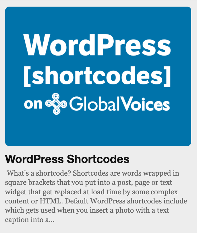
What's a [shortcode]? Shortcodes are words wrapped in square brackets that you put into a post, page or text widget that get replaced at load time by some complex content or HTML. Default WordPress shortcodes include [caption] which gets used when you insert a photo with a text caption into a post.
[WordPress Shortcodes] added by the GV Plugin to various GV sites. These aren't part of WordPress, they are things added by Jer Clarke.
Most GV content doesn't require these shortcodes, they are mostly designed for special occasions and special pages that are only created once for each site.
SEE ALSO WordPress Widgets and Sidebars to learn about how widgets work and how you can use shortcodes to supercharge them!
[gvavatar]
[gvavatar] Shows the avatar of just one user. The avatar links to their full profile page and floats next to text.
Example Uses
[gvavatar id="12"]
Shows the avatar of the user with user_id 12.
[gvavatar name="ethan-zuckerman" size="120"]
Shows the avatar of the user with the exact login name of ‘Ethan Zuckerman’ and resizes the image to 120px square.
Arguments
id A user id. You can tell a user id by looking at the ‘edit user’ url of a user.
name Login name of a user. This is their login name that is present in their author URL.
size Size in pixels of the image. Default is 96px. Avatars shouldn't be more than 240px, and should always be a multiple of 24.
[gvuser]
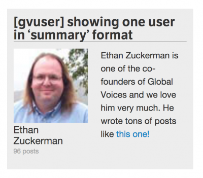
[gvuser] shortcode used in a sidebar widget
[gvuser] is replaced with the profile of a single user on the current site. It is just like [gvuserlist] described below but for one user at a time.
Example Uses
[gvuser name='ethanzuckerman']
Display user profile for user with login name ‘ethanzuckerman’. Default arguments show user in the ‘summary’ type (avatar, name and post count).
[gvuser id='12' type="profile"]
Show the user with ID 12 (find user IDs in the URL of their ‘edit user’ link) and use the profile format (avatar, name and full bio).
Arguments
id User ID of a user to show.
name Login name of a user to show.
type – Which format to use (same as [gvuserlist] see above). Default is ‘summary’ (avatar, name and post count)
[gvuserlist]
[gvuserlist] is replaced with a listing of authors from the current site. It supports several formats for full bios, summaries, avatars and just links. You can also show a subset of users by limiting their number or filtering for activity or whether they have avatars.
Example Uses
[gvuserlist]
Default arguments show all users in the ‘summary’ type (show avatar, name and post count).
[gvuserlist type="avatars" has_avatar='1' limit='16']
Show “avatar” format (just author photos in a grid) and use has_avatar='1' to ONLY show authors that have uploaded an avatar (avoids generic placeholder avatar). Also set limit='16' so that a maximum of 16 avatars will be shown.
[gvuserlist type="text" active='no']
Show ‘text’ type which is just usernames and limit results to inactive users (haven't posted in the last 90 days).

[gvuserlist] showing ‘summary’ type listing.
Arguments
type – Which format to use. Choices are:
- profile Full bio with avatar, name, bio and various links (not recommeded).
- summary Avatar, name and post count.
- avatars Show only avatars linked to the author pages.
- names Simple text list of user's names linking to their author pages.
limit Maximum number of users to show. Default shows all users that match other criteria.
user_ids Comma-separated list of user ID numbers (found in a user's edit profile URL), e.g. user_ids=”1,6,14″ Only these users will be shown.
has_avatar Setting this to 1 will limit results to users that have uploaded an avatar, useful for lists of sample users to avoid generic icons.
has_post Set to “0” to include all users even if they haven't posted. Default only shows users with at least one post.
active – “yes” or “no”. Yes will limit the list to only authors with a post published in the last 90 days, no will show only users that haven't posted in the last 90 days. This is useful for showing active users prominentely (‘summary’ type) while showing older users more efficiently (‘names’ type). Default is to show all users regardless of active status.
random Default false. Set random='1′ to shuffle results before display.
size Avatar size in pixels if avatars are shown.
separator – text to show between links in ‘names’ format. Default is “, ” (i.e. they are separated by commas”).
[gv_promo_card]
What is a “promo card”?
This refers to a design feature of the GV theme, where an image and text are shown together in a way that automatically resizes and re-flows based on the size of the space they are in. Posts on the homepage show as “promo cards”, as do posts, terms, and users displayed with the [gv_post_promo], [gv_term_promo], and [gv_user_promo] shortcodes described below.
Why use a “promo card” instead of HTML? We use them to ensure that the image and text will be elegantly-aligned no matter how big the space is. For example a widget that is “skinny” at full width, because it's in a row of 3, could suddenly become much wider at a smaller screen size, when it's shown on its own. Using a “promo card” layout ensures that it will always look good.
[gv_promo_card] displays a generic “promo card” with completely customizable image and text.
The generic [gv_promo_card] shortcode is useful for times when there is no post, page, term, or user to show, but you have an image and text that you want to align, because you can just pass it the image URL, alt text, and the text block and it will assemble the card for you.
Example Uses
[gv_promo_card image_url="https://globalvoices.org/logo.png" image_alt_text="Global Voices Logo"]<h3>Heading!</h3>Text that will float next to or below the image, depending on size. <a href='/more/'>Learn more!</a>[/gv_promo_card]
Show a logo with text. Note that this shortcode uses a closing [/gv_promo_card] tag, and anything in between the opening and closing tags will be used as text! This allows us to put anything we want in between, including complex HTML!
Arguments
image_url (Mandatory) URL of an image to be shown. Make sure it is big enough for the largest possible view of this card.
image_alt_text (Mandatory) Description of the image to be shown, for accessibility.
text (Mandatory) The text goes between [gv_promo_card] and [/gv_promo_card], and can contain any HTML.
image_link_url Set a URL for the image to link to, e.g. image_link_url='https://globalvoices.org'
large Set large=1 to use the “large” display format, with larger image and headings.
dense Set dense=1 to use “dense” display format, which makes the image smaller on mobile and matches how posts are displayed.
compact Set compact=1 to use the “compact” display format, with smaller image and headings.
aspect_ratio Set an aspect ratio (shape) for the image, such as 1/1 for square, or 16/9 and 4/3 for different rectangles. E.g. aspect_ratio='16/9'
[gv_post_promo]
Example of [gv_post_promo] for this page, as it would appear in a widget.
Example Uses
[gv_post_promo id="1776" ]Display a promo card for the page with id of 1776, which happens to be this page!
Finding the id of a post or page is easy! Just look at the URL of the edit screen for the post, you should see a part like ?post=1776, that number is the ID that you can use in this shortcode.
Arguments
id (Mandatory) Numeric post ID of the post or page to embed.
excerpt Set excerpt="Custom excerpt text." specify a custom excerpt to be used rather than the one configured on the post's edit screen.
image_url Set image_url='https://URL' to specify a custom image to be used rather than the one configured as the featured image of the post or page on its edit screen. Should be 16:9 format and at least 600px.
large Set large=1 to use the “large” display format, with larger image and headings.
compact Set compact=1 to use the “compact” display format, with smaller image and headings.
aspect_ratio Set an aspect ratio (shape) for the image, such as 1/1 for square, or 16/9 and 4/3 for different rectangles. E.g. aspect_ratio='16/9'
text Completely replace the automatically-generated title and excerpt with customized text. To do so, put the custom text between [gv_post_promo] and [/gv_post_promo] tags. Custom text can contain any HTML.
[gv_term_promo]
Example of [gv_user_promo] used in a homepage text widget.
category) or a Special Category (gv_special). The display will be similar to posts on the homepage, with the image, title and excerpt automatically aligned depending on how much space is available. To control the image and excerpt text, you should edit the term itself, e.g. by visiting a category and clicking the Edit Category button in the menu bar at the top of the screen.
Example Uses
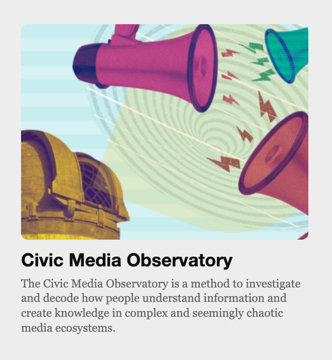
[gv_term_promo taxonomy='category' term='politics' ]Display a promo card for the Politics category. Note that you must always specify both the term (it's slug name from the URL) and the taxonomy, to indicate what kind of term it is.
Display a promo card for the Civic Media Observatory term, which is a Special Category, so we use gv_special as the taxonomy value.
Arguments
taxonomy (Mandatory) Slug name of the taxonomy the term is in. Usually this will be category or gv_special.
term (Mandatory) Slug name of the term from its URL or edit term screen, without spaces or capitalization. E.g. east-asia.
excerpt Set excerpt="Custom excerpt text." specify a custom excerpt to be used rather than the one configured on the term's edit screen.
image_url Set image_url='https://URL' to specify a custom image to be used rather than the one configured as the featured image on the term's edit screen. Should be 16:9 format and at least 600px.
large Set large=1 to use the “large” display format, with larger image and headings.
compact Set compact=1 to use the “compact” display format, with smaller image and headings.
aspect_ratio Set an aspect ratio (shape) for the image, such as 1/1 for square, or 16/9 and 4/3 for different rectangles. E.g. aspect_ratio='16/9'
text Completely replace the automatically-generated title and excerpt with customized text. To do so, put the custom text between [gv_term_promo] and [/gv_term_promo] tags. Custom text can contain any HTML.
[gv_user_promo]

Example of the [gv_user_promo] as it would appear in a post.
Warning: [gv_user_promo] does not work on translations, and the shortcode will result in errors if a post with this shortcode is ever translated to another site!
If you are working on content that might be translated, please use [gv_lingua_user_promo] instead!
Example Uses
[gv_user_promo user_id='99' ]Display a promo card for the user with ID 99. You can find a user's ID in the URL of their edit user screen.
[gv_user_promo user_login='jane-doe' bio="Custom text to replace their profile's bio text"]Show a user based on their login name, rather than ID, as well as specifying a custom “bio” text, which might be useful if you want to say something specific about that user without editing their profile.
[gv_user_promo user_login='jane-doe' compact=1 show_bio=0]Show a compact user card, which will make the image and text show much smaller. Also use the show_bio=0 argument to hide the bio, since it might be too long for the small display.
Arguments
user_id (Mandatory to provide this or user_login) numeric user ID of the user to show, as found in the URL of their “Edit User” screen.
user_login (Mandatory to provide this or user_id) login name of the user to show, which can be found in their “Edit User” screen.
bio Set a custom bio text to replace the one set in the user's profile.
show_bio Set show_bio=0 to hide the bio text.
large Set large=1 to use the “large” display format, with larger image and headings.
compact Set compact=1 to use the “compact” display format, with smaller image and headings.
image_url Set image_url='https://URL' to specify a custom image to be used rather than the user's avatar. Should be square and at least 600px.
text Completely replace the automatically-generated name and bio with customized text. To do so, put the custom text between [gv_user_promo] and [/gv_user_promo] tags. Custom text can contain any HTML.
[gv_lingua_user_promo]

Example of [gv_lingua_user_promo], with custom user_title and bio text, as it would appear in a post.
The downside of [gv_lingua_user_promo] is that it only provides the image and username link by default, because the Lingua system doesn't have access to the user_title or bio text. If you want to show the user_title or bio, you need to specify them manually in your shortcode, as shown in the demonstrations below.
When in doubt, please use this shortcode rather than [gv_user_promo] to avoid errors when posts are translated!
Example Uses
[gv_lingua_user_promo site='globalvoices_en' user_id='99' ]Display a very simple promo card with only the avatar and name of the user with ID 99. You can find a user's ID in the URL of their edit user screen.
[gv_lingua_user_promo site='globalvoices_en' user_login='jane-doe' user_title="Translation Manager" bio="Description of who Jane Doe is to show as the bio text."]Show a user based on their login name, rather than ID, as well as specifyinguser_title or bio text to be shown in the card.
Show a compact user card, which will make the image and text show much smaller, useful for long lists of users.
Arguments
user_id (Mandatory to provide this or user_login) numeric user ID of the user to show, as found in the URL of their “Edit User” screen.
user_login (Mandatory to provide this or user_id) login name of the user to show, which can be found in their “Edit User” screen.
site (Mandatory) Lingua site slug for the site the user is on, such as site='globalvoices_en, site='globalvoices_es' or site='advocacy_en'
user_title Set a user title to show below the username, for example “Translation Manager” or “Author”. By default no user title will show, regardless of the user's profile settings.
bio Set bio text to show for the user. By default no bio will show, regardless of the user's profile settings.
large Set large=1 to use the “large” display format, with larger image and headings.
compact Set compact=1 to use the “compact” display format, with smaller image and headings.
image_url Set image_url='https://URL' to specify a custom image to be used rather than the user's avatar. Should be square and at least 600px.
text Completely replace the automatically-generated name with customized text. To do so, put the custom text between [gv_user_promo] and [/gv_user_promo] tags. Custom text can contain any HTML.
[gv_promo_card_container_grid_3]
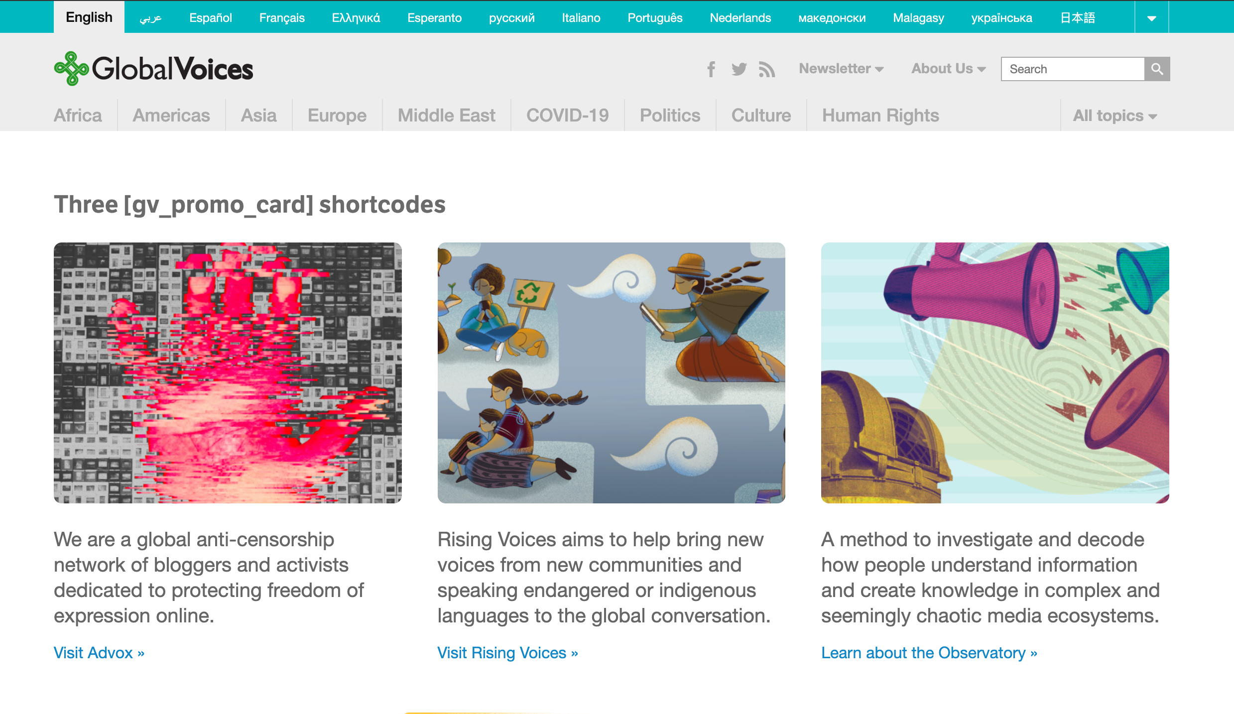
The [gv_promo_card_container_grid_3] shortcode displaying three custom [gv_promo_card] shortcodes.
This works with the following shortcodes inside of it:
- [gv_promo_card]
- [gv_post_promo]
- [gv_term_promo]
Example Uses
[gv_promo_card_container_grid_3][gv_post_promo id="1776" ][gv_post_promo id="1777" ][gv_post_promo id="1778" ][/gv_promo_card_container_grid_3]
Display three post promo cards in a grid. Note that only promo cards work in this grid, so whatever you want to show, find a way to get it into a promo card, e.g. using the generic [gv_promo_card] described above.
Note that all the shortcodes are on the same line! Do not “hit enter” between shortcodes, or the grid may display wrong in Firefox!
[gv_promo_card_container_grid_3][gv_post_promo id="1776" ][gv_term_promo taxonomy='gv_special' term='observatory' ][gv_promo_card image_url="https://example.com/image.jpg" image_alt_text="Description of image"]Custom text for this promo card[/gv_promo_card][/gv_promo_card_container_grid_3]
Display a grid with three different types of promo cards!
Warning: When using promo cards with the text option, where there is a closing [/shortcode] tag and the content in between is displayed, the results might be confusing, with tags that don't get converted. To fix this, make sure that either none of the matching cards are using the text option, or all of them are.
Arguments
text The only option for this shortcode is the text, which goes between the [gv_promo_card_container_grid_3] and [/gv_promo_card_container_grid_3] tags. It should be nothing but a set of 3 other shortcodes that generate promo cards.
[gv_map]
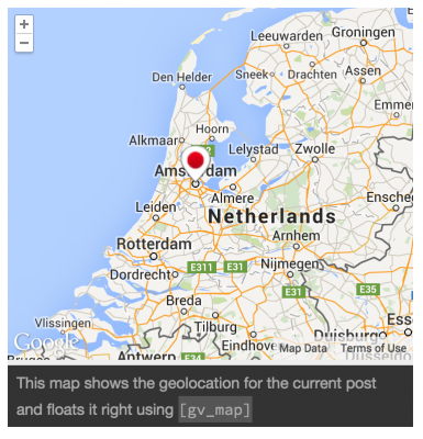
Single post map generated from [gv_map map_content='single' align='right' size='small']
Learn more about geolocating posts in GV: Geolocating Global Voices: Add your stories to the map!
Example Uses
[gv_map]
Display a map. This example is missing map_content so it will guess which type of map to show, this is not recommended.
[gv_map map_content='single']
Displays map with a pin for the coordinates of the current post (map_content='single’). By default maps are the width of their container.
[gv_map map_content='global' align='right']
Align the post right like an image, it will be 50% width. Will show a global map because of map_content='global’
[gv_map map_content='single']This is a caption that will show below the map[/gv_map]
Show the current post map by adding a caption between the [gv_map] and [/gv_map] tags.
Arguments
map_content Map type:
- global – All posts
- single – Current post only
- contextual – Other posts loaded on this page.
size Control height of map, default “medium”.
- small
- large
align Float the map left or right at 50% width like an image. Default full width.
- right
- left
caption Show a text caption below map. Caption can also be set between the [gv_map] and [/gv_map] tags where links can be added.
zoom Amount of map to show from 0-20, Default is “auto”. Very tricky to get right.
limit Max number of pins to show in map.
max_width Max-width in px or % for container. Limit the maximum width to a specific amount.
map_type Visual tile set. Default is in site configuration or G_NORMAL_MAP.
- G_NORMAL_MAP
- G_SATELLITE_MAP
- G_HYBRID_MAP
- G_PHYSICAL_MAP
[gvinlinerss]
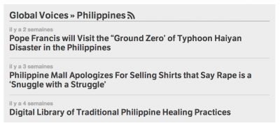
[gvinlinerss] displays headlines or excerpts of items from an RSS or Atom feed. It has many options to control display. It has the same basic settings as the GV Banner RSS widget, but for use inside post or page content.
Example uses
[gvinlinerss feed_url="https://globalvoices.org/feed/"]
Show a feed with the default settings: 5 posts, small headlines and images, dates visible, and no excerpts.
[gvinlinerss feed_url="https://globalvoices.org/feed/" count=10 show_dates="0" hide_title="1"]
Show a feed with 10 items, dates hidden and the heading above the widget.
Arguments
feed_url The url of an RSS feed. Mandatory
count How many posts to show. Default: 5
compact Set compact=0 to disable compact mode, which will make the headlines and featured images match the homepage.
show_excerpts Set show_excerpts="1" to show the first couple lines of item content after item titles. Default “0” (headlines only).
show_dates Set show_dates="0" to hide the date on each feed item. Default “1”.
show_featured_image Set show_featured_image="0" to hide thumbnails/featured-images if they are present in feed. Default “1”.
title Set a custom title with title="Custom Title Text". Default is site name from the feed itself.
hide_title Set hide_title="1" to hide the top heading completely. This inherently overrides the ‘rss_icon’, ‘title’ and ‘link_title’ arguments because the title won't be showing.
[gvpages]
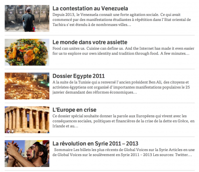
[gvpages] shortcode showing children of Special Coverage
The default order uses the menu_order value for each page, which sorts them to match how they appear on the Edit Pages list in the WordPress admin. You can use the Simple Page Ordering plugin in WP to easily re-order the pages from within the Edit Pages list. Other ordering options are available through the orderby and order arguments, explained below.
Example Uses
[gvpages show_thumbnail="0"]Show all pages, but hide thumbnails.
[gvpages parent="self" count="5"]Show children of the current page, but only the first 5. Order them by their last modified date.
[gvpages page_ids="17, 18, 22"]Show a list of specific pages using their post_id's.
[gvpages parent="self" orderby="modified" order="DESC"]Show all children of the current page, sorted by the date they were last updated, starting from the most recently saved. It uses orderby="modified" to sort by save date and order="DESC" to sort in descending order, i.e. starting with the most recently saved.
Arguments
parent Default none. Set parent="self" to show children of the current page, otherwise pass a post_id to show children of that page.
page_ids Default none. Comma-separated list of post_id‘s for pages to show, like page_id="1,9,33". Only these pages will show.
count How many pages to show. Leave empty to show all pages that fit the other criteria.
show_excerpt Default 1, enabled. Set to 0 to hide excerpts.
show_thumbnail Default 1, enabled. Set to 0 to hide featured images.
orderby How to sort the pages, default date. Can be any of the following:
date– Date page was published.modified– Date last updated, combine withorder='DESC'to show most recent first.title– Alphabetically by title.menu_order– “Order” setting from Page Attributes box in editor, matching order in Edit Pages list.rand– Random order
order Which way to sort based on orderby, ASC (ascending value) or DESC (descending value), default ASC, which works well with most orderby values.
[gvrsslist]

[gvrsslist] showing region categories.
Example Uses
[gvrsslist taxonomy_slug="regions"]Show all region categories and their rss feeds.
Arguments
taxonomy_slug – Must be part of the site's taxonomy. For the main GV site the acceptable slugs are:
- regions
- countries
- topics
- special
- type
[gvtaxonomylist]
[gvtaxonomylist] will be replaced with a list of category/taxonomy terms. It always requires the taxonomy argument (like ‘category’ or ‘gv_geo’) to work, otherwise it will show an error. The output is shown in two columns to fit more items in a smaller space.
Example Uses
[gvtaxonomylist taxonomy='topics']Show a list of all topic categories.
[gvtaxonomylist taxonomy='category' get_terms_args='parent=317']Use get_terms_args special formatting to show children of category with ID 317.
Arguments
taxonomy_slug – Natural or registered public taxonomy. For the main GV site the acceptable slugs are:
- regions
- countries
- topics
- special
- type
- categories
format – Format string:
- list (default)
- toggle-menu
- text
- collapsed
children_format – Format for sublistings of child terms with grandchildren (see Format options)
show_children – Whether to do full sub listings of children and their children.
get_terms_args – Optional array of arguments to pass to get_public_taxonomy_terms, overrides taxonomy definitions. Allows all args of WP's built-in get_terms() function. See example above for its strange formatting.
title – Override default title text.
hide_title Hide title entirely, default false.
hide_empty Whether to exclude terms with no posts. Default true. Use hide_empty='' to force display of empty terms.
column_count – How many columns to display for immediate children, default 1.
children_column_count – How many columns to display in sublists
[gvotherlangs]
[gvotherlangs] will be replaced with a formatted list of all Lingua sites that are other translations of the current site, as used on https://globalvoices.org/lingua/lingua-sites/
Example uses
[gvotherlangs]
Show all sites in alphabetical order.
[gvicon]
[gvicon] will be replaced with an inline text icon from the “GV Icons” set of SVG images in the GV Plugin. The icons flow normally with text and work similar to emoji, but with the benefit that they match their color to the text around them.
For the full list of icons, see the Tools > GV Icons screen in the /wp-admin/ of the GV WordPress site you are using.
Example Uses
[gvicon icon="wordpress" alt="WordPress"]
Show the ‘wordpress’ icon at the default size (16px, should fit in a normal line of text) and with an alt label of “WordPress” for those that can't see the graphic.
[gvicon icon="feed" align='right' size='48px']
Show the ‘feed’ icon aligned right (so it floats like an image) and 48px tall.
Arguments
icon (Required) The icon to show, names are listed below. e.g. icon='wordpress'
alt (Optional) Label for vision impaired people. Add this unless there is text with the icon that duplicates it. e.g. label='WordPress'
size (Optional) Make the icon bigger than 16px, e.g. size='32px'
align (Optional) Float the icon like an image, either right, left, or center. e.g. align='right'
[gvpaypal]

A French donate button created with [gvpaypal]
The shortcode will also attempt to automatically set the ‘lang’ value for you based on the language of your lingua site. You can still set it manually if you want. PayPal also tries to detect the language of the browser and use that, so hopefully your readers will see a localized PayPal interface even if you don't.
Example Uses
[gvpaypal]
Show the default donation button linking to paypal where the user can choose their own donation.
[gvpaypal text="Give us some love!"]
Default paypal button but with alternate text.
[gvpaypal lang="fr" img="https://site.com/custom_image.jpg"]
Link to French version of paypal).
[gvpaypal button_id="XXXXXXXXX"]
Use a specific saved button (NOT FOR LINGUA)
Arguments
lang ISO code (fr, ar, es) to control the Paypal interface. If they do not support your language then English will be used.
text Button text to override default “Donate to Global Voices”
button_id Alphanumeric Paypal “saved button” ID to override the default.
[toc] and [no_toc]
These shortcodes are part of the Table of Contents plugin we use, which usually generates an automatic table of contents at the top of the post if there are several headings present, but depending on the configuration you may have to manually insert the [toc] shortcode to make it show.
[no_toc] disables the ToC entirely regardless of whether it shows by default or the number of headings in the article. Put [no_toc] anywhere you want in the post text, it will be invisible to readers. [no_toc] has no arguments.
[toc] will cause the ToC to be shown in the part of the article where you put the shortcode, rather than in the default location and regardless of the default configuration
Arguments
label Title of the table of contents.
no_label Whether to hide the label. Default “false”. Use “true” to hide ToC title.
heading_levels Numeric. List of heading levels to show,Separate multiple levels with a comma. E.g. use “heading_levels=2″ to only display <h2> tags, or “heading_levels=3,4″ to only show <h3> and <h4>
class CSS classes to be added to the container. Separate multiple classes with a space. e.g. class="alignnone" to have a full-screen ToC.