Contents
In this post, I'll explain what the final choice was and why we made it, then lay out the next big test, which is already running on the live site and will eventually lead to a potentially-major overhaul of the “featured posts” section at the top of the homepage!
Winner of the Post Archive test: “list-wide”!
To refresh your memory, here were the three versions of the homepage we were testing:

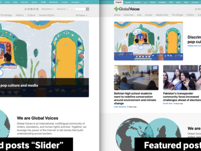
Screenshots of the three versions that the test compared. Click to enlarge!
So the difference, as you can see, is whether the posts in the main list were in a “list” (the middle option above, with a small image on the left and text on the right”) or a “grid” (the rightmost image above, with the images above the text and multiple posts per row). The first above was our old design, with widgets showing next to the posts list. We included the old design as a “control group”.
The results were very interesting! What we were looking for was how much people clicked on each part of the homepage, with our goal being to pick the version that got people to open up a story, or keep exploring the site. Here's what we found:
- List-Wide (the center option above) had the most clicks by far. More people clicked on the posts in the main list, more people clicked on the featured posts above and on the Advox and Rising Voices posts. They clicked on pretty much everything more!
- The Grid-3 format (on the right), which many people like the look of, just didn't get a lot of clicks, sadly. Even the old Default format (on the left) with the ugly sidebar got more clicks on posts and features than the grid format. For one reason or another, people just didn't engage with them.
- When we looked at more general metrics, like how long people were on the page, and how likely they were to leave without doing anything, we found that List-Wide won there too. When people were shown the List-Wide version they had a lower “bounce rate”, they viewed more pages per visit, and they spent more time on the site.
The question I ask myself, seeing these results, is why? Why did Grid-3 fail so badly, when so many people (including in the comments on the last post) seemed to prefer that format? My best explanation is that in the test we were already using the Grid-3 format, just above the main posts where we showed Advox, Rising Voices, and Bridge. I suspect that having variety is more important than picking a single perfect format, so in the layout where the main posts were different from the ones above, that worked best.
Overall, the results were very decisive, and our conclusion was thankfully pretty easy: Going forward, the ideal format for GV homepages will be the “List-Wide” format.
We haven't enforced this format on all GV and Lingua sites, but it's already running on the English GV homepage, and we hope you like it as much as we do. I keep sighing with relief when I see the new layout, it's open space on the sides helps me relax and choose a story to read with patience.
Manage a Lingua site and want the new look? Just clean up the widgets!
The “List-Wide” format, at this point, is just what happens when you remove all widgets from the sidebars that show on the homepage. Without widgets in those sidebars, the list moves to the center. So if you want “List-wide” on a GV site, just follow these instructions:
- Visit Appearance > Widgets in
/wp-admin/ - Move all widgets out of the following sidebars: Homepage Sidebar Top and General Sidebar Widgets
- Instead, find homes for those widgets in one of the following sidebars (several of which are newly-added!)
- Homepage Top Grid 33%: These will show as three small widgets between the featured posts, and the normal posts. On the GV English site this is where we put the Advox/Rising Voices/Bridge widgets.
- Homepage Before Archive 100%: These will show above the main posts on the homepage, but in full-width widgets, so be careful if the content was assuming it would be in a skinny 33% widget!
- Homepage Bottom Grid 33%: This is the same as the “Homepage Top Grid” describe above, but it's below the main posts. Put things here that you want to show just above the footer.
- Homepage After Archive 100%: Again, this is like “Homepage Before Archive” but at the bottom of the site.
Next challenge: The featured posts header
With that question settled, and after a variety of cleanup to implement the results, I moved on to the next steps in our long-term plans to revitalize and optimize the homepage design: Cleaning up the featured posts header.
The main issue with the current “featured posts” header is that there are two distinct and inter-related pieces: the big image slider, and the widget next to it:
The old featured posts header, with it's awkward sidebar widget that needs to go.
Having these two looks okay at desktop size, but gets awkward at tablet and mobile sizes, where the relationship between the two things isn't very clear, and ends up getting in the way. In terms of the backend code, this setup is even worse, there's way too much code running on our site just to support this mess!
Our goal with this section, as with the rest of the site, is to have each “row” of horizontal objects be independent and “whole”, composed of things that match, because that makes it way easier to have them make sense on mobile where everything is stacked on top of each other rather than lined up horizontally. We already did this with the main posts list by removing the sidebar, and now we want to apply this to the rest of the site.
Thus the project at hand: Design a new featured posts header that is full-width, has no sidebar next to it, and is just as or more effective than the old one.
New Test: Featured posts formats
With that we arrive at our new A/B test, which is a competition between our best ideas for full-width features sliders.
Contestant #1: Features Slider
The most obvious choice for how to make our features slider full-width is simple: Just make it bigger, and full-width! To test this idea, we modified the existing slider to be wider, and it is one of the formats that will be tested. Here's how it looks:
The full-width version of the features slider is much bigger than the old one, but makes large photos shine.
This format has the same strengths as the old slider: It makes images look great, and it grabs the attention as something unique on the page.
It also has some weaknesses, as I see it: It's huge size means it takes up a lot of space on the page, and still only shows one post at a time. Also, as with any slider, it comes with issues around usability and accessibility. If you already have trouble clicking on website tools, it is much easier to interact with a simple list of content, rather than content that is moving and sliding as you try to click on it.
Carousels and sliders like this have a bit of a bad reputation in the web design community. While they remain fairly common, all else equal, it would be a benefit to remove this one from the GV sites. At the same time, if this slider is really more effective at getting visitors to read our stories, then isn't that worth it? That's why we're running an objective test, we want to know what really works and what doesn't.
Worth noting: We are testing two different versions of this slider, one with a 16:9 format, which is pretty wide but still quite tall in the context of our site design, and one with an ultra-wide “panoramic” format, which is shorter and wider. We're testing these two separately to see if having the images take up less space has an effect on how much people click on page elements that are lower down.
Contestant #2: Features Grid
The second option is a totally new design and layout which uses a mix of a new Large format of post promo card, and a row of posts in the now-familiar Grid-3 format. Here's how it looks on the homepage:

The “Features Grid” format has no slider, instead using the space to show 4 posts with large images.
The strengths of this format, as I see it, are the dynamic layout of the first post, with it's huge eye-catching text, and the fact that it shows all 4 posts at once, giving visitors an immediate buffet of our best content to choose from. All four have relatively large images, and the first post still commands attention by having the largest image on the page.
The weaknesses, from my perspective, are the lack of animation, which may make it less appealing to some visitors, and the fact that the use of the Grid-3 format for the last three posts can end up looking too similar to the content below, like in the screenshot above, where the featured posts and subsequent special categories look very similar.
Mobile comparison
Lest we forget that the majority of our visitors now come in on mobile devices, here is a comparison of the two options as they appear on a typical phone:

The mobile versions are both more limited than the desktop versions, of course.
As with the desktop versions, the slider excels at showing a large image, but only shows one post at a time, while the grid gets all 4 posts in front of the visitor, but takes up more space. I'm especially interested to see if the “winner” is different for mobile than it is for desktop 🤔
Keep an eye out for these variants on the homepage, and let me know what you think!
We'll have to see the results of the test to know for sure which of these is most engaging to our audience. Meanwhile, please comment below to let me know which of these new options you think should be chosen, and any feedback you have about them!