GV Test Post: Formats


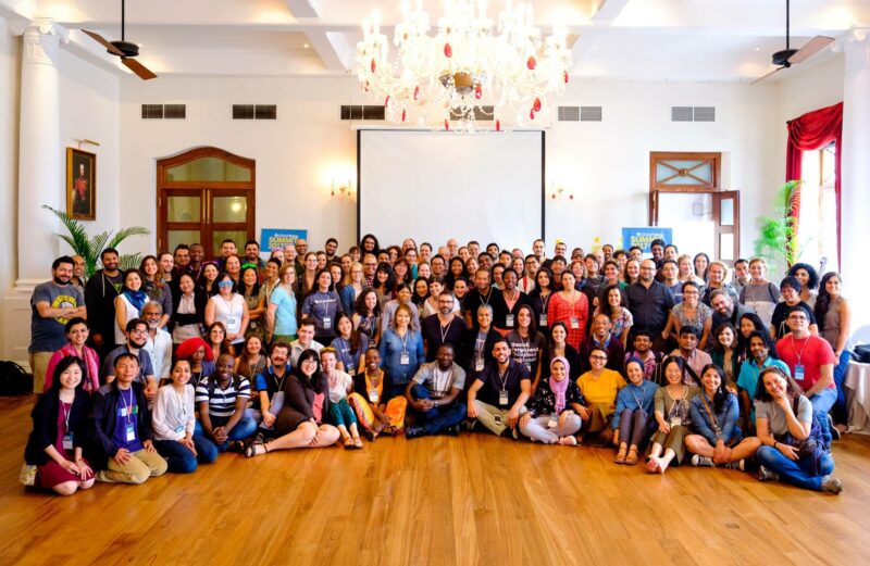
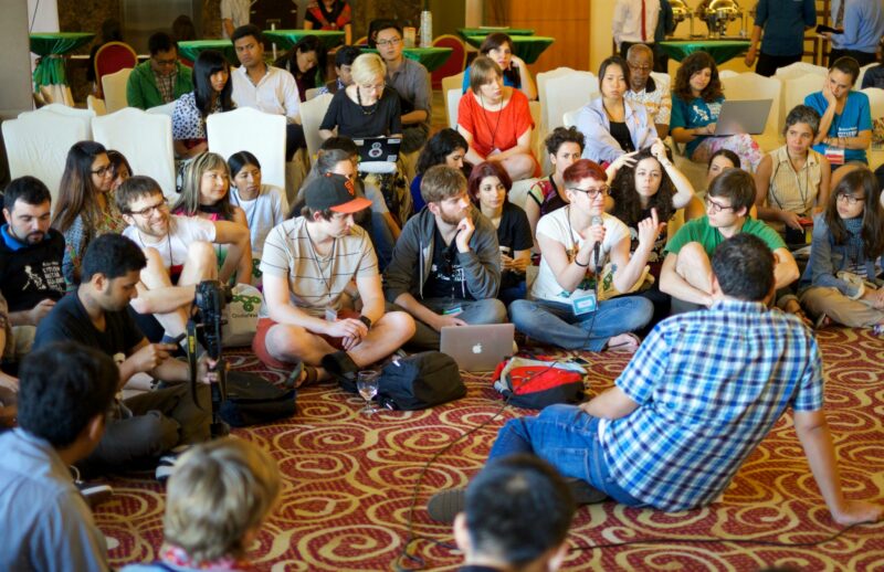
Most posts start with a full-width image. This is a Huge (1200px) image, so it should fill the width of the post on both normal and Extra-wide layout. Here is a link to globalvoices.org to make sure links look good in captions!
See also: WordPress Posting Guide
Other test posts: Shortcodes, Embeds
This is a demo article that uses all of the supported HTML and CSS formats available for Global Voices posts. They should all work on desktop, mobile, and AMP versions of the site.
To see this post with the “Extra-wide” layout add /?gv_extra_wide=1 to the end of the URL.
Contents
- 1 Images
- 2 Quotes
- 3 Lists
- 4 Big tag
- 5 Contributors block
- 6 Notes block
- 7 Pull-Quotes
- 8 Factboxes
- 9 Full-width Factbox
- 10 Right-aligned Factbox
- 11 Left-Aligned Factbox
- 12 GV Promo Cards
- 13 GV Test Post: Formats
- 14 GV Test Post: Formats
- 15 GV Test Post: Formats
- 16 GV Test Post: Formats
- 17 GV Test Post: Formats
- 18 GV Test Post: Formats
- 19 GV Test Post: Formats
- 20 GV Test Post: Formats
- 21 Promo card container grid 3
- 22 Generic Nicelist
- 23 Tables
- 24 Headings
- 25 H3: Third-level heading
- 26 H3 line-height: This h3 is so long it should wrap to two lines and show the line-height.
- 27 Example posts demonstrating challenges
- 28 Reference: Images in various sizes uploaded to globalvoices.org
Images
Images are a huge part of GV. They can be different sizes and they can float left and right if needed.
Huge full width image WITH caption
This Huge (1200px) image should fill the full width of the screen whether in normal or Extra-wide layout.
Example Huge (1900px) full-width image with caption
Huge full-width image WITHOUT caption
This is the same Huge (1200px) image, but without a caption.
Extra-wide note: Images without captions will never be “extra wide” due to complications with the HTML and CSS, they just fill the same width as paragraphs. To make an image fill the screen in Extra-wide layout, use a caption!
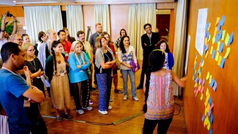
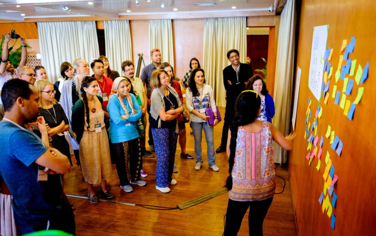
Large unaligned image WITH caption
This Large (800px) image is the ideal size to be full-width on a normal layout post.
Extra-wide note: When using Extra-wide layout a Huge size image (1200px), like the examples above, is needed to fill the horizontal space. If an image is too small and doesn't have a Huge option, set the alignment to left, right, or center to make it look good in Extra-wide. This Large image isn't big enough to fill the space in Extra-wide layout, so it should be given center alignment, but we left it unaligned to demonstrate the issue.
Example Large (800px) image that isn't wide enough for an “extra wide” post
Large unaligned image WITHOUT caption
The same Large (800px) image but without a caption.
Extra-wide note: In Extra-wide layout this image will be the same width as paragraphs because it doesn't have a caption (as described above) so the Large size is still fine.
Left and right-aligned images WITH captions
Images floated left or right automatically show at 50% width on large screens, then full-width on mobile devices. Text should flow around them automatically.
When adding left or right-aligned images to a normal post that not using the Extra-wide layout, the Medium (400px) size is big enough, and using the smaller size will make the page load more quickly.
In Extra-wide layout, you should instead use the Large (800px) size because they will appear bigger.
The examples below use Large (800px) images, making them appear high-resolution on both normal and Extra-wide layout.

Example of a Large (800px) image with caption floated right and filling the 50% space even on “extra wide”. This image also has a very long caption that will wrap to multiple lines, showing how it looks when there's a long text.
Phasellus velit diam, interdum sed tincidunt viverra, porttitor et elit. Etiam auctor, arcu vel tempor congue, erat risus porta dui, vel vestibulum orci massa vel felis. Pellentesque et nisl lacus. Vestibulum consectetur accumsan venenatis. Vivamus vitae nibh sit amet ante porta sollicitudin sed nec lectus. Suspendisse potenti. Etiam semper neque et orci tincidunt euismod. Suspendisse bibendum eleifend dolor, a ornare tellus tristique sit amet. Cum sociis natoque penatibus et magnis dis parturient montes, nascetur ridiculus mus. In accumsan ultricies neque eu suscipit. Pellentesque habitant morbi tristique senectus et netus et malesuada fames ac turpis egestas. Praesent malesuada pharetra arcu non pretium. Vestibulum a mollis felis. In sit amet lacus vitae est semper bibendum. Donec vel urna velit. Ut enim risus, scelerisque at ultricies nec, eleifend vel nunc. Fusce quis ultricies massa.
Example of an image with caption floated Left.
Nulla eu lorem at ante semper elementum. Quisque hendrerit gravida eros, ut gravida dolor posuere quis. Etiam tincidunt arcu eget ipsum imperdiet mattis. Donec tempor nisl eu mi blandit et adipiscing elit consequat. Suspendisse a odio tincidunt tortor gravida auctor. Vestibulum a mollis felis. In sit amet lacus vitae est semper bibendum. Donec vel urna velit. Ut enim risus, scelerisque at ultricies nec, eleifend vel nunc. Fusce quis ultricies massa. Nam venenatis dapibus risus non laoreet. Duis et arcu vel metus faucibus pellentesque vestibulum vitae lectus. Suspendisse sed turpis augue, non pellentesque quam. Maecenas faucibus, quam id facilisis posuere, nulla tortor laoreet quam, sed volutpat erat justo ac tortor. Maecenas pulvinar nulla ultrices urna fermentum sit amet tincidunt nunc bibendum. Donec accumsan tortor in ante pharetra nec dictum nibh consequat.
Left and right-aligned images WITHOUT captions
The same Large 800px images as above, but without captions.
Extra-wide note: In Extra-wide layout these images will be confined within the limited horizontal width of the paragraphs due to the same HTML and CSS issues mentioned in the Large full-width image WITHOUT caption section above. To make floated images bigger and cause them to “break out” of the paragraphs, add a caption!
Phasellus velit diam, interdum sed tincidunt viverra, porttitor et elit. Etiam auctor, arcu vel tempor congue, erat risus porta dui, vel vestibulum orci massa vel felis. Pellentesque et nisl lacus. Vestibulum consectetur accumsan venenatis. Vivamus vitae nibh sit amet ante porta sollicitudin sed nec lectus. Suspendisse potenti. Etiam semper neque et orci tincidunt euismod. Suspendisse bibendum eleifend dolor, a ornare tellus tristique sit amet. Cum sociis natoque penatibus et magnis dis parturient montes, nascetur ridiculus mus. In accumsan ultricies neque eu suscipit. Pellentesque habitant morbi tristique senectus et netus et malesuada fames ac turpis egestas. Praesent malesuada pharetra arcu non pretium. Vestibulum a mollis felis. In sit amet lacus vitae est semper bibendum. Donec vel urna velit. Ut enim risus, scelerisque at ultricies nec, eleifend vel nunc. Fusce quis ultricies massa.
Nulla eu lorem at ante semper elementum. Quisque hendrerit gravida eros, ut gravida dolor posuere quis. Etiam tincidunt arcu eget ipsum imperdiet mattis. Donec tempor nisl eu mi blandit et adipiscing elit consequat. Suspendisse a odio tincidunt tortor gravida auctor. Vestibulum a mollis felis. In sit amet lacus vitae est semper bibendum. Donec vel urna velit. Ut enim risus, scelerisque at ultricies nec, eleifend vel nunc. Fusce quis ultricies massa. Nam venenatis dapibus risus non laoreet. Duis et arcu vel metus faucibus pellentesque vestibulum vitae lectus. Suspendisse sed turpis augue, non pellentesque quam. Maecenas faucibus, quam id facilisis posuere, nulla tortor laoreet quam, sed volutpat erat justo ac tortor. Maecenas pulvinar nulla ultrices urna fermentum sit amet tincidunt nunc bibendum. Donec accumsan tortor in ante pharetra nec dictum nibh consequat.
Quotes
Here's a simple blockquote.
Lorem ipsum dolor sit amet, consectetur adipiscing elit. Phasellus velit diam, interdum sed tincidunt viverra, porttitor et elit. Etiam auctor, arcu vel tempor congue, erat risus porta dui, vel vestibulum orci massa vel felis. Pellentesque et nisl lacus. Vestibulum consectetur accumsan venenatis. Vivamus vitae nibh sit amet ante porta sollicitudin sed nec lectus. Suspendisse potenti.
Here's a translated blockquote, which should display as two tabs, “Translation” and “Original Quote”, when previewed.
This is the original quote, hidden in a tab by default. Lorem ipsum dolor sit amet, consectetur adipiscing elit. Phasellus velit diam, interdum sed tincidunt viverra, porttitor et elit. Etiam auctor, arcu vel tempor congue, erat risus porta dui, vel vestibulum orci massa vel felis. Pellentesque et nisl lacus. Vestibulum consectetur accumsan venenatis. Vivamus vitae nibh sit amet ante porta sollicitudin sed nec lectus. Suspendisse potenti.
This is the translated quote, showing by default. Pellentesque et nisl lacus. Vestibulum consectetur accumsan venenatis. Vivamus vitae nibh sit amet ante porta sollicitudin sed nec lectus. Suspendisse potenti. Lorem ipsum dolor sit amet, consectetur adipiscing elit. Phasellus velit diam, interdum sed tincidunt viverra, porttitor et elit. Etiam auctor, arcu vel tempor congue, erat risus porta dui, vel vestibulum orci massa vel felis.
Here's a right-to-left blockquote with the .rtl style in it.
في خضم حراك عالمي ضد العنصرية تنقسم فرنسا حول المصير الذي سيتم تخصيصه لتماثيل تمثل شخصيات تاريخية مرتبطة بالرق أو الاستعمار.
Lists
Here's a simple unordered list <ul>:
- First item.
- Second item.
- Third item long enough to reach multiple lines. Lorem ipsum dolor sit amet, consectetur adipiscing elit. Phasellus velit diam, interdum sed tincidunt viverra, porttitor et elit. Etiam auctor, arcu vel tempor congue, erat risus porta dui, vel vestibulum orci massa vel felis.
- Fourth item.
Here's an ordered list <ol>:
- First item.
- Second item.
- Third item long enough to reach multiple lines. Lorem ipsum dolor sit amet, consectetur adipiscing elit. Phasellus velit diam, interdum sed tincidunt viverra, porttitor et elit. Etiam auctor, arcu vel tempor congue, erat risus porta dui, vel vestibulum orci massa vel felis.
- Fourth item.
Big tag
The text below uses the <big> tag, it should have a larger font and distinct style.
This text should be bigger.
Contributors block
The .contributors style is usually used at the end of a document to indicate other people who worked on the story.
Notes block
The .notes style is similar to .contributor and ads visually-distinguished notes to the beginning or end of a post.
Pull-Quotes
Pull-quotes make text large and optionally floated to the right or left. The following text enables their format to be visualized.
This is a
.pull-quoteat full width, it is basically just giant text that isn't a heading. Note that all pull-quotes end up being full-width at mobile sizes.
This is a
.pull-quote.alignright, it will float to the right at 50% of the document width.
The links in this paragraph go to GV posts that use pull quotes. Mass tree-planting in Ethiopia broke world records, but its impact will take time. Etiam auctor, arcu vel tempor congue, erat risus porta dui, vel vestibulum orci massa vel felis. The fault lines in Cameroon's national peace talks. Pellentesque et nisl lacus. Vestibulum consectetur accumsan venenatis. In Nigeria, disability activists say social stigma is greatest obstacle to human rights. Suspendisse potenti. Etiam semper neque et orci tincidunt euismod. Suspendisse bibendum eleifend dolor, a ornare tellus tristique sit amet.
This is a
.pull-quote.alignleft, it will float to the left at 50% of the document width.
Nulla eu lorem at ante semper elementum. Quisque hendrerit gravida eros, ut gravida dolor posuere quis. Etiam tincidunt arcu eget ipsum imperdiet mattis. Donec tempor nisl eu mi blandit et adipiscing elit consequat. Suspendisse a odio tincidunt tortor gravida auctor. Vestibulum a mollis felis. In sit amet lacus vitae est semper bibendum. Donec vel urna velit. Ut enim risus, scelerisque at ultricies nec, eleifend vel nunc. Fusce quis ultricies massa. Nam venenatis dapibus risus non laoreet.
Factboxes
“Factboxes” are <div> tags that use the .factbox style to create a block with a colored background to isolate certain information, such as an explainer of “facts” related to a story. Factboxes can be used for anything you want to visually distinguish though, and allow various content like images, headings, and lists inside of them. They can be floated right or left to display at 50% width, similar to pull-quotes and images.
Full-width Factbox
This factbox wasn't given an alignment, so it will just be a full-width area that has a colored background. Here's an example list.
- This is the first list item
- This is the second list item
- This is a third list item
Lorem ipsum dolor sit amet, consectetur adipiscing elit.
Right-aligned Factbox
This is a .factbox.alignright and it will take up 50% of the article width for sizes bigger than “mobile” (and 100% width at mobile).
Example of a Large (800px) image inside a .factbox and with a caption
Links in this paragraph lead to example GV posts that use .factbox. In Tunisia, women stand on the frontlines of targeted hate speech online Etiam auctor, arcu vel tempor congue, erat risus porta dui, vel vestibulum orci massa vel felis. How identity-driven conflicts fuel Ethiopia's incendiary social media rhetoric. Vestibulum consectetur accumsan venenatis. How does Rwanda’s genocide ideology law regulate speech online?. Suspendisse potenti. COVID-19 is rapidly exhausting Bangladesh healthcare system amidst alarming rise of infected people. Cum sociis natoque penatibus et magnis dis parturient montes, nascetur ridiculus mus.India's digital ID system deepens exclusion of vulnerable communities amid pandemic.Pellentesque habitant morbi tristique senectus et netus et malesuada fames ac turpis egestas. Praesent malesuada pharetra arcu non pretium.
Left-Aligned Factbox
Factboxes can also be left-aligned, though right-alignment usually works better.
Large (800px) image in a .factbox without a caption.
Nulla eu lorem at ante semper elementum. Quisque hendrerit gravida eros, ut gravida dolor posuere quis. Etiam tincidunt arcu eget ipsum imperdiet mattis. Donec tempor nisl eu mi blandit et adipiscing elit consequat. Suspendisse a odio tincidunt tortor gravida auctor. Vestibulum a mollis felis. In sit amet lacus vitae est semper bibendum. Donec vel urna velit. Ut enim risus, scelerisque at ultricies nec, eleifend vel nunc. Fusce quis ultricies massa. Nam venenatis dapibus risus non laoreet. Duis et arcu vel metus faucibus pellentesque vestibulum vitae lectus. Suspendisse sed turpis augue, non pellentesque quam. Maecenas faucibus, quam id facilisis posuere, nulla tortor laoreet quam, sed volutpat erat justo ac tortor. Maecenas pulvinar nulla ultrices urna fermentum sit amet tincidunt nunc bibendum. Donec accumsan tortor in ante pharetra nec dictum nibh consequat.
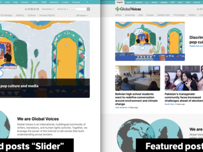
GV Promo Cards
The [gv_promo_card] shortcode and it's siblings like [gv_term_promo] and [gv_post_promo] are used to display an image along with a block of text in an elegant and responsive way, automatically switching to move the text below the image at smaller sizes.
This is an example of the [gv_post_promo] set to self="1", so it shows the promo card for the current post in the default format:

GV Test Post: Formats
This post full of demo content covers all the major styles and formats supported by the GV theme, and should work with both normal and “Extra-wide” layouts.
This is an the same as above but with the large="1" flag set, which should make the image and text bigger.
GV Test Post: Formats
This post full of demo content covers all the major styles and formats supported by the GV theme, and should work with both normal and “Extra-wide” layouts.
This promo card has no link on the image, in case that changes the formatting.
And here are three promo cards in a row, simulating various shortcodes that show groups of posts, pages, or terms so we can review the spacing between them. Note they are all on one line in the source, otherwise they get <br> inserted between each card and there's too much space.
GV Test Post: Formats
This post full of demo content covers all the major styles and formats supported by the GV theme, and should work with both normal and “Extra-wide” layouts.
GV Test Post: Formats
This post full of demo content covers all the major styles and formats supported by the GV theme, and should work with both normal and “Extra-wide” layouts.
GV Test Post: Formats
This post full of demo content covers all the major styles and formats supported by the GV theme, and should work with both normal and “Extra-wide” layouts.
Another list of promo cards, this time with compact="1".
GV Test Post: Formats
This post full of demo content covers all the major styles and formats supported by the GV theme, and should work with both normal and “Extra-wide” layouts.
GV Test Post: Formats
This post full of demo content covers all the major styles and formats supported by the GV theme, and should work with both normal and “Extra-wide” layouts.
GV Test Post: Formats
This post full of demo content covers all the major styles and formats supported by the GV theme, and should work with both normal and “Extra-wide” layouts.
Promo card container grid 3
[gv_promo_card_container_grid_3] allows the display of three “GV Promo Cards” that should show in three-to-a-row when using extra-wide, but would look too cramped in a constrained width. This example uses “custom” [gv_promo_card] shortcodes with manually-set content, but this should also work with dynamic cards showing posts, terms, users etc.

Generic Nicelist
This is a .nicelist. This format isn't set up to be added automatically in the editor but should be supported in posts.
- Lorem ipsum dolor sit amet
- consectetur adipiscing elit.
- Phasellus velit diam, interdum sed tincidunt viverra, porttitor et elit.
- Etiam auctor, arcu vel tempor congue
Tables
Simple tables should look simple and elegant on GV, despite not having elaborate styles. Here is an example:
| Style type | Supported on GV | Special classes required |
|---|---|---|
| Blockquotes | ✅ | N/A |
| Translated blockquotes | ✅ | .translation |
| Galleries | 🚫 | N/A |
| Tables | ✅ | N/A |
Warning: Tables work, but will looked very squished on small mobile screens, so tables inserted in posts should be as simple as possible and avoid having many horizontal columns.
Here's an example of a table with too much stuff in it, to see what happens. The last column is probably cut off on mobile!
| Style type | Supported on GV | Special classes required | Another column | Something else | Just too many columns |
|---|---|---|---|---|---|
| Blockquotes | ✅ | N/A | N/A | N/A | N/A |
| Translated blockquotes | ✅ | .translation |
N/A | N/A | N/A |
| Galleries | 🚫 | N/A | N/A | N/A | N/A |
| Tables | ✅ | N/A | N/A | N/A | N/A |
Headings
The .factbox below has examples of all the headings that can be used on GV. Note that only H3 and H4 are recommended for use inside of posts, and they should be big and dynamic as shown throughout the rest of this article. H1 and H2 are demonstrated here only so we can make sure they look okay in case people mistakenly use them.
H1: First-level heading
Should never be used.
H2: Second-level heading
H2 is also not recommended, but should still work normally on GV.
H3: Third-level heading
H3 is the recommended heading for use inside posts
H4: Fourth-level heading
H4's should be used when a document is complex enough to have sub-headings that need to be visually smaller than h3.
H5: Fifth-level headings
H5 should work but rarely be used. Visually it will look like bold text, but can be used to ensure the heading shows up in a Table of Contents. Avoid this if possible.
H1 line-height: This h1 is so long it should wrap to two lines and show the line-height.
H2 line-height: This h2 is so long it should wrap to two lines and show the line-height.
H3 line-height: This h3 is so long it should wrap to two lines and show the line-height.
H4 line-height: This h4 is so long it should wrap to two lines and show the line-height.
Sorry for that mess.
Example posts demonstrating challenges
This is the end of the post formats test post. We'll have some text at the bottom so the spacing matches how posts commonly end, but really it would be good to test every one of the formats above at the bottom of the post too, in case the spacing is weird. I love you, good luck.
Reference: Images in various sizes uploaded to globalvoices.org
Images hidden with div style='display:none;’, edit the post to see various sizes of demo image.


